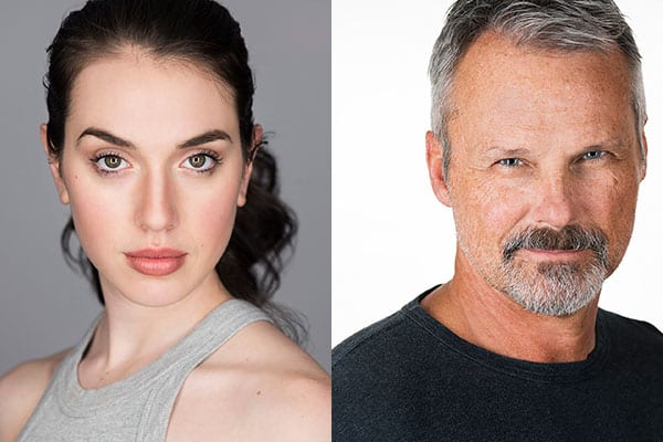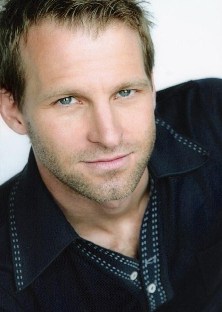
When I worked as a crime scene photographer, there was an undercover officer from another agency that always introduced himself differently. He had different names and stories, seemingly dependent on the way the wind blew. This made sense in his job, when he was playing a role, but did nothing but confuse all of us in my office. After all, why not be clear with those you work with, even occasionally? If you want people to understand your message, it must be clear. The same holds true in an actor’s portfolio, which is your story. And a good story always starts with a clear introduction, which is why an excellent portfolio should start with a solid headshot. Your headshot is your visual introduction.
Your book is often the tool used to grab a casting agent’s attention. Knowing this, young actors often try to get the agent’s attention with an artful, dramatic photo on the first page. These photos have their places, but not as the lead photo in your book. The temptation is great, after all everyone tells you how cool that dramatic photo is. Don’t be lured into leading with a dramatic photo. Lead with a headshot that draws the agent in, grabs him or her, and won’t let go.
Agents and directors know they can get the look and feel they want, cinematically. Lighting and production will give them the mood they will need. However, your look is mostly out of their hands. When looking for cast members they want to know what they are getting. Therefore, the first shot in your portfolio should be your face, plain and simple. No cinematic color grading or shadows. No over the top, attention getting clothes. This lead-off photo, your headshot, should be a positive representation of who you are. The lighting and exposure should be spot on, of course, but your expression should be what captivates the agent. This shot will lay the foundation for the rest of your book. As agents look further, the positive impression laid at the beginning will linger. Let photos further in your book, or better yet your reel, sell your dramatic side.
Once you have decided a professional headshot will lead off in your book, how should it look? It should be all about your face. Your face is the star of the show. Personally, I like the shirt or blouse worn to show an inch, or two below a standard neckline. People looking at your headshot should be able to get an idea of what you are wearing. Picture showing a tie knot and the top of the tie, or a couple inches below a crew neck tee shirt. Enough clothing to let someone know what you are wearing, but not enough to take away attention from your face. What about photo orientation? The layout, or orientation, of the photo can be vertical or horizontal. Run this by your agent. I like a horizontal 8×10 photos. We are used to horizontal screens, from our HD TVs to theatre screens. The 8×10 has been a standard for a long time, and is comfortable to look at. An 8×10 keeps the viewer’s attention on your face. A wider angle (widescreen) view takes you too far from the center of attention, and allows an agent’s eye to wonder too much. In order to seamlessly transition to other photos, whether horizontal or vertical, work with your agent and photographer(s). The person reviewing your book shouldn’t be continuously having to turn it to view photos, although most people won’t mind having to reorient your book a couple times.
Remember, the first photo should be a clear introduction. It is your opening scene. Your headshot should lure agents in without dramatic effects. Keep it simple and engaging.
 Greg Thomason is a headshot photographer in Nashville, Tennessee. His work can be viewed here.


